FordPass™ - Design System Upgrade
Overview
As a UI designer at VMLY&R, I and the design team reinvented the mobile app's whole design system from 2.0 to 3.0 for our client, Ford Motor Company. The new design system includes icons, colors, typography, and components. Our focus is to follow the latest design trends while highlighting Ford's design language.
Tools
Sketch, Invision, Zeplin, Abstract
Platform
IOS, Android
My Role
UI Design, Usability Testing, Prototyping
Time
2020
About FordPass™
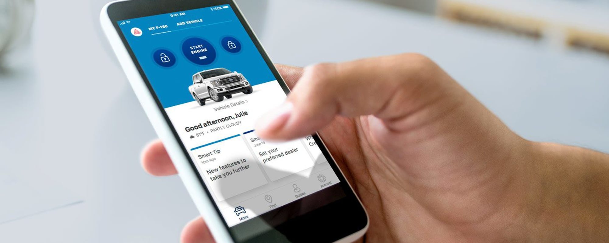
FordPass™ is an app to monitor & control your Ford vehicle. Use the remote start, stop or unlock, find nearby gas stations, check oil life and gas levels, find parking & more.
Challenge
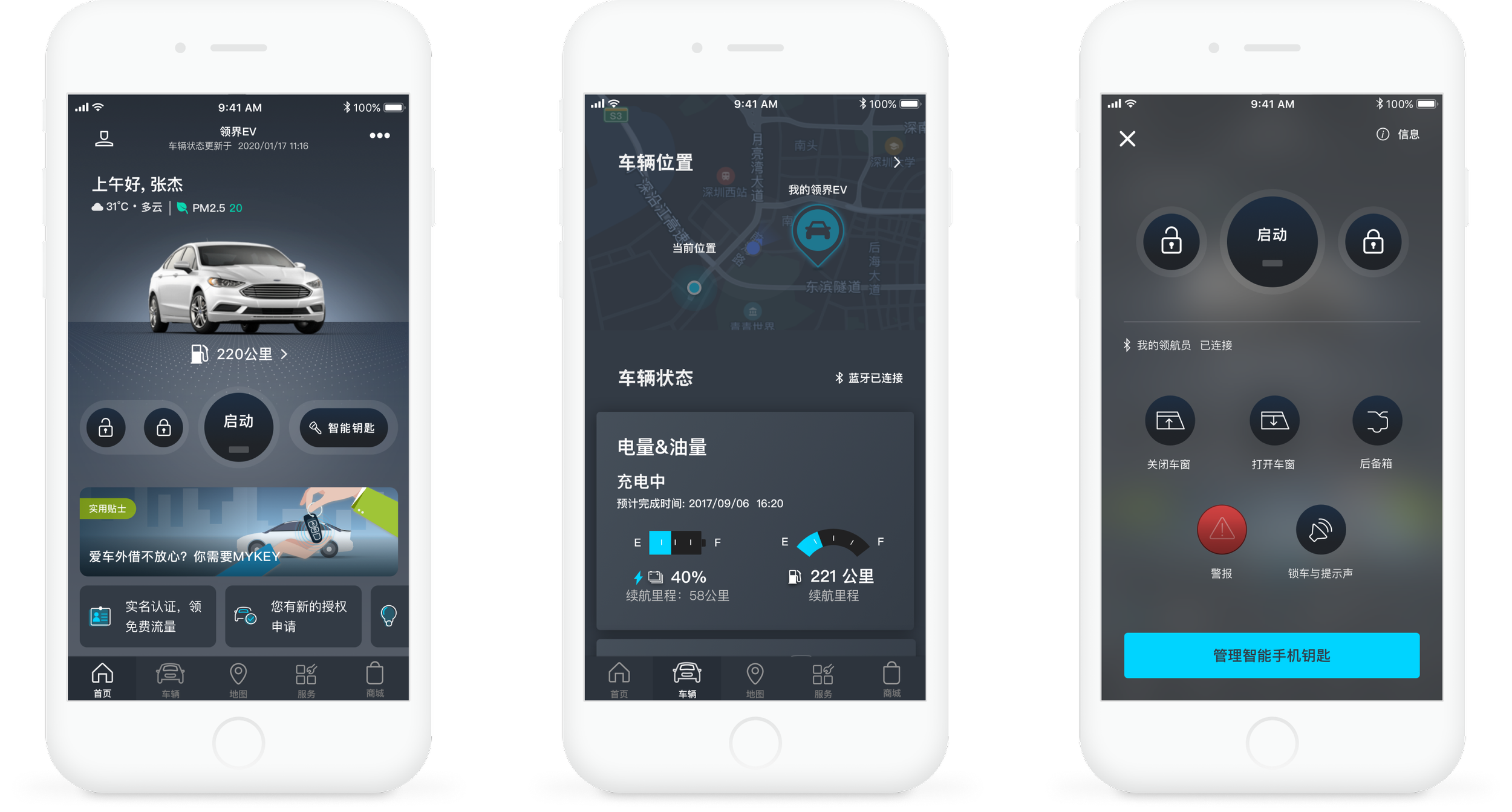
There are a lot of problems with the current version of the design because previous designers didn't strictly follow a style guide. So the first thing we need to do is to sort out all the current design problems, classify them into four major categories of icon, color, typography, and components, and redesign them separately. This is a very large project and it took me and the whole design team a lot of time.
Framing the problems
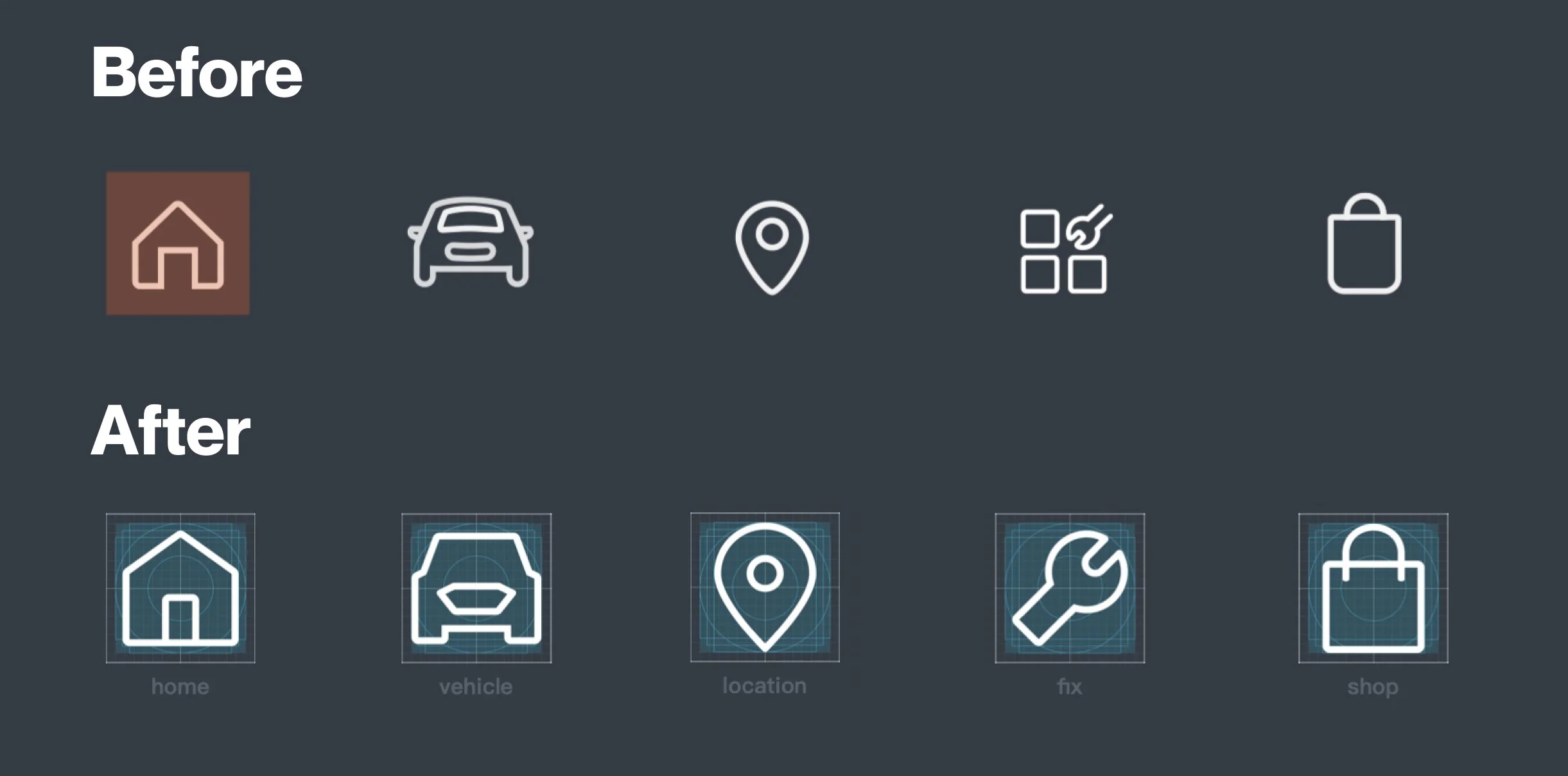
Same meaning but different shape
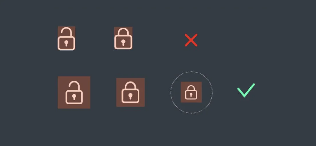
Inconsistent size
Visually complex
New guideline
Grid system
We used a new grid in the design to ensure that every icon is visually the same size.
Five sizes
From 16x16px to 64x64px, 5 sizes will be used in various interface scenarios.
Design validation
We have designed several versions of the icon. Then, we did a workshop and invited colleagues and clients to vote for their favorites. Through the feedback of the majority, the design team can better make the final design.
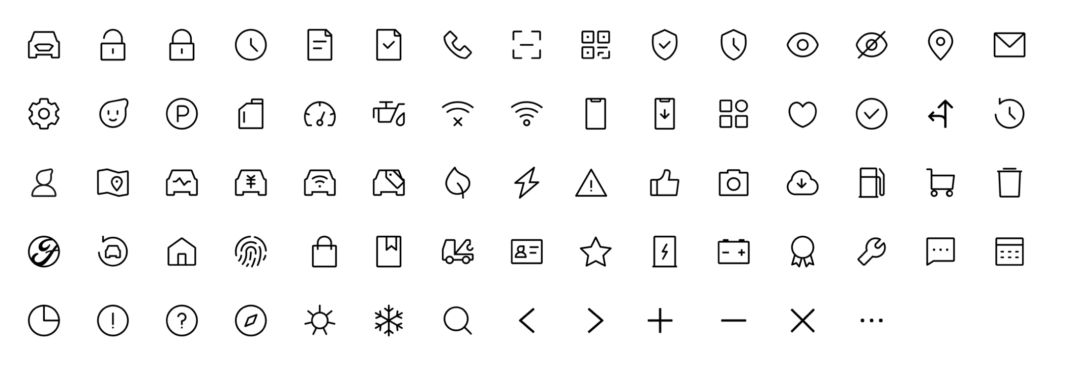
Refreshing the Icon System
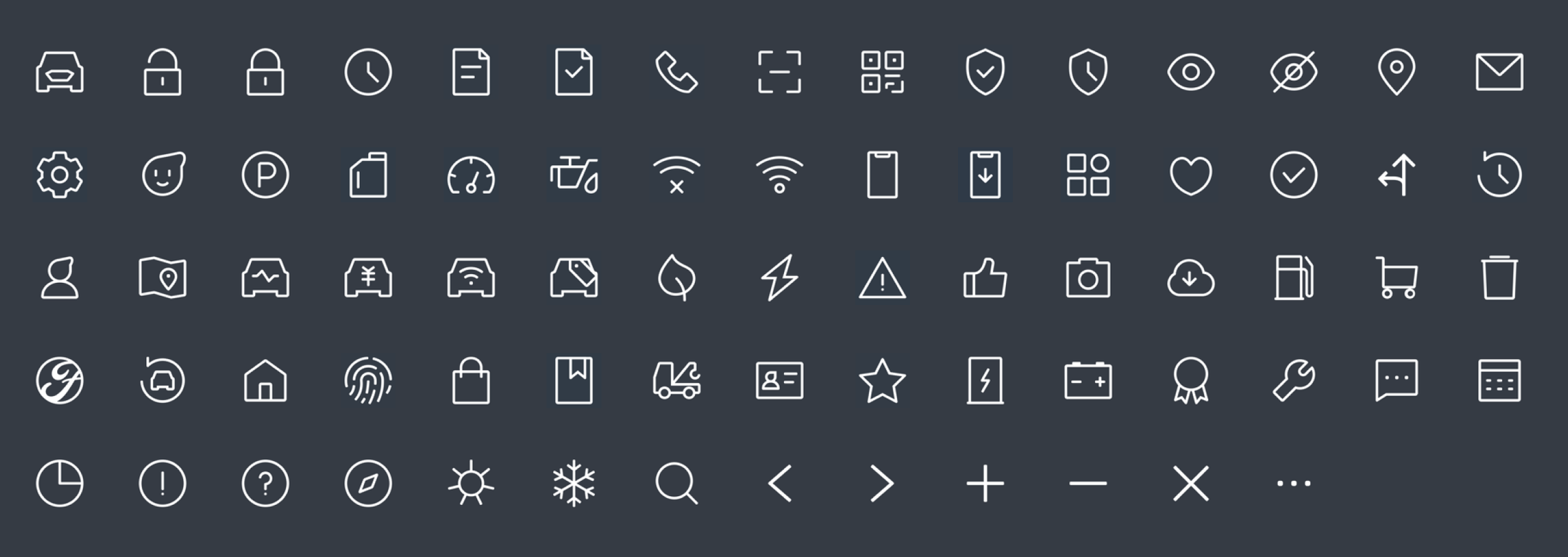
We merged the sets by redrawing every single icon in the new style with thicker strokes. The vast majority of icons keep the same metaphor as before.
Light Mode
Dark Mode
Apply new icons in interface
We apply the new icon to the UI to see how well it fits. And adjust details such as stoke thickness and size. Finally, we cooperated with the development team to start replacing all icons.

